Identity system design
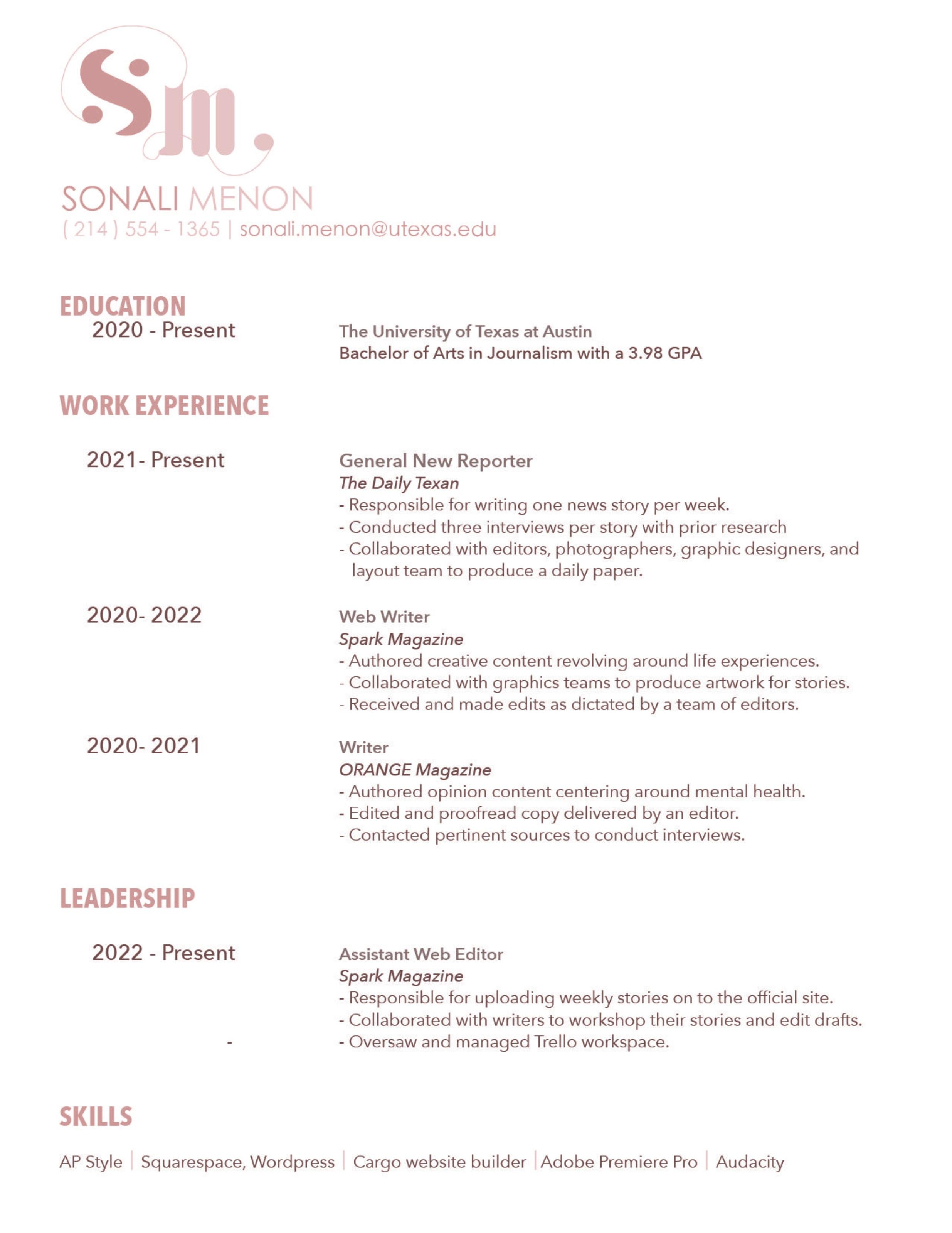
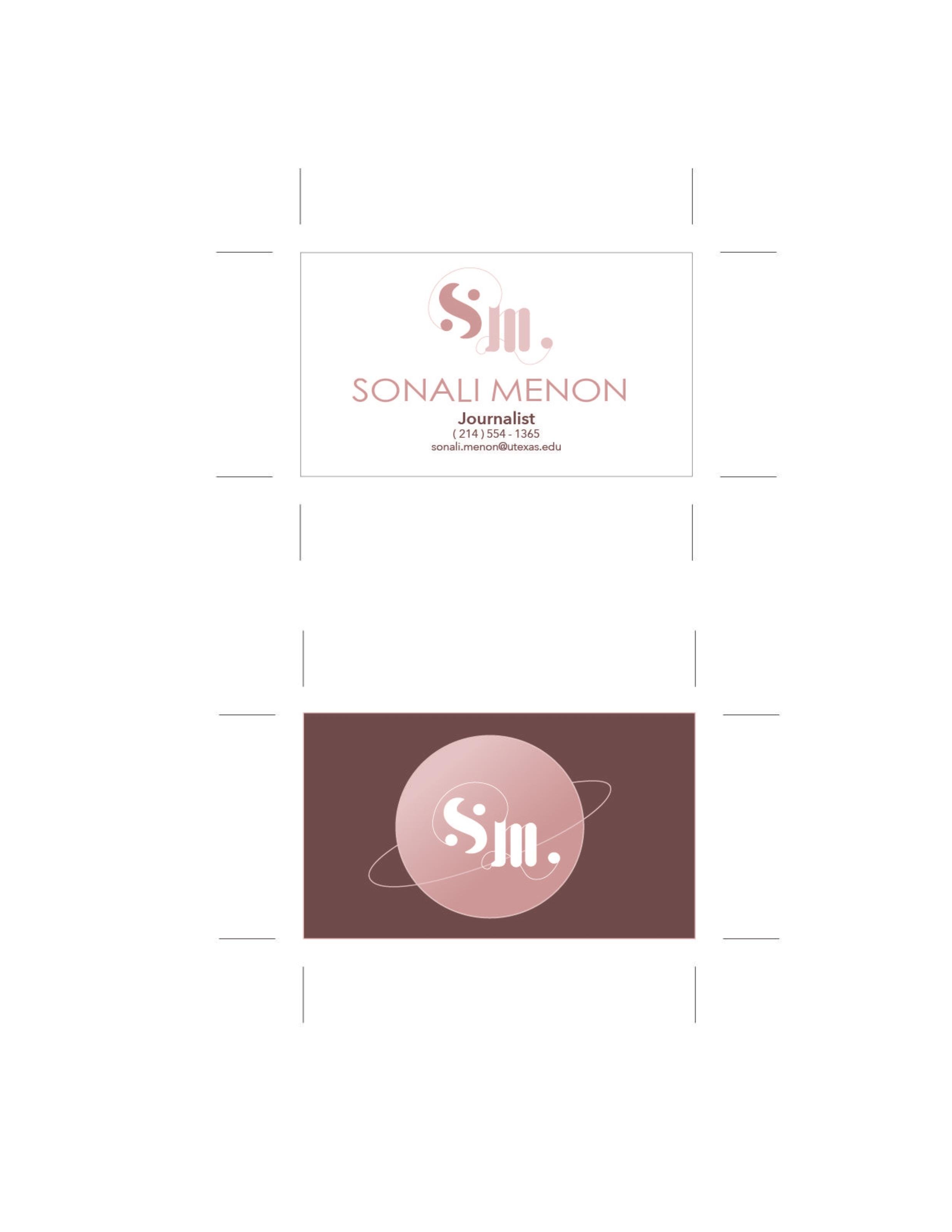
When developing a vision for my personal brand, I knew I wanted it to have a celestial, elegant, and futuristic aura. I chose to incorporate circular, orbital, and planetary imagery in my design because I currently focus on scientific research reporting. To convey this elegantly celestial theme, I wanted to contrast simple sans serif fonts with cursive-adjacent sans serif fonts. I also decided to use a blush-toned color palette because it is very soft and has a fresh connotation. However, since they are muted tones, they still appear professional, unlike if I had used more vibrant pinks. I mainly focused on a medium blush tone, which I incorporated into my text’s logo and headers. I contrasted this color with a dark, brown-toned blush shade, which I used for the body text in my resume and cover letter. For information I deemed less critical in my documents, I used a light blush tone color font and this shade in my logo to add contrast to the design.
For my logo, I wanted to set it apart from the other elements of my identification system by making it curvier and incorporating a more celestial theme. I used the medium blush shade for the “S” in the logo since it stands for my first name, so I wanted it to be the most distinct element on the page. I used the light blush tone for the “M” to create a stark contrast between my initials and make it more readable. The “M” and “S” are connected at the terminal of the “S,” where they join in a closed circle. The reasoning for this was to incorporate subtle imagery resembling the orbital pathways of planets. The curvy line connecting the two letters is ovular in shape, and the circle is meant to be emblematic of a planet. Similarly, the “M” has a serif on the bottom left-hand side of the first stem, which flourishes into a loop and ends with a circle. This flourish was made similarly to the previously mentioned connecting line, as it was meant to be a loose representation of planetary orbital paths. I wanted the apexes of each letter in the logo to be at different heights to show a hierarchy of importance. Therefore, the “S” has a higher apex than the “M.” To maintain uniformity with the two letters, I tried to keep the cap height of each the same. To create a more elegant and curvy logo, I wanted to make the “S” have apparent stress on the spine leading up to each circular terminal. I separated the “S’s” terminals from the spine to create visual interest and add to the planetary theme. I chose to portray the logo’s “m” in lower case to emphasize its capital “S.” I also added two hairline strokes to the shoulders of the “M.” Including this adds a more elegant effect to the overall look of the logo and creates more visual interest and uniformity to the design by mirroring the flourishing lines.
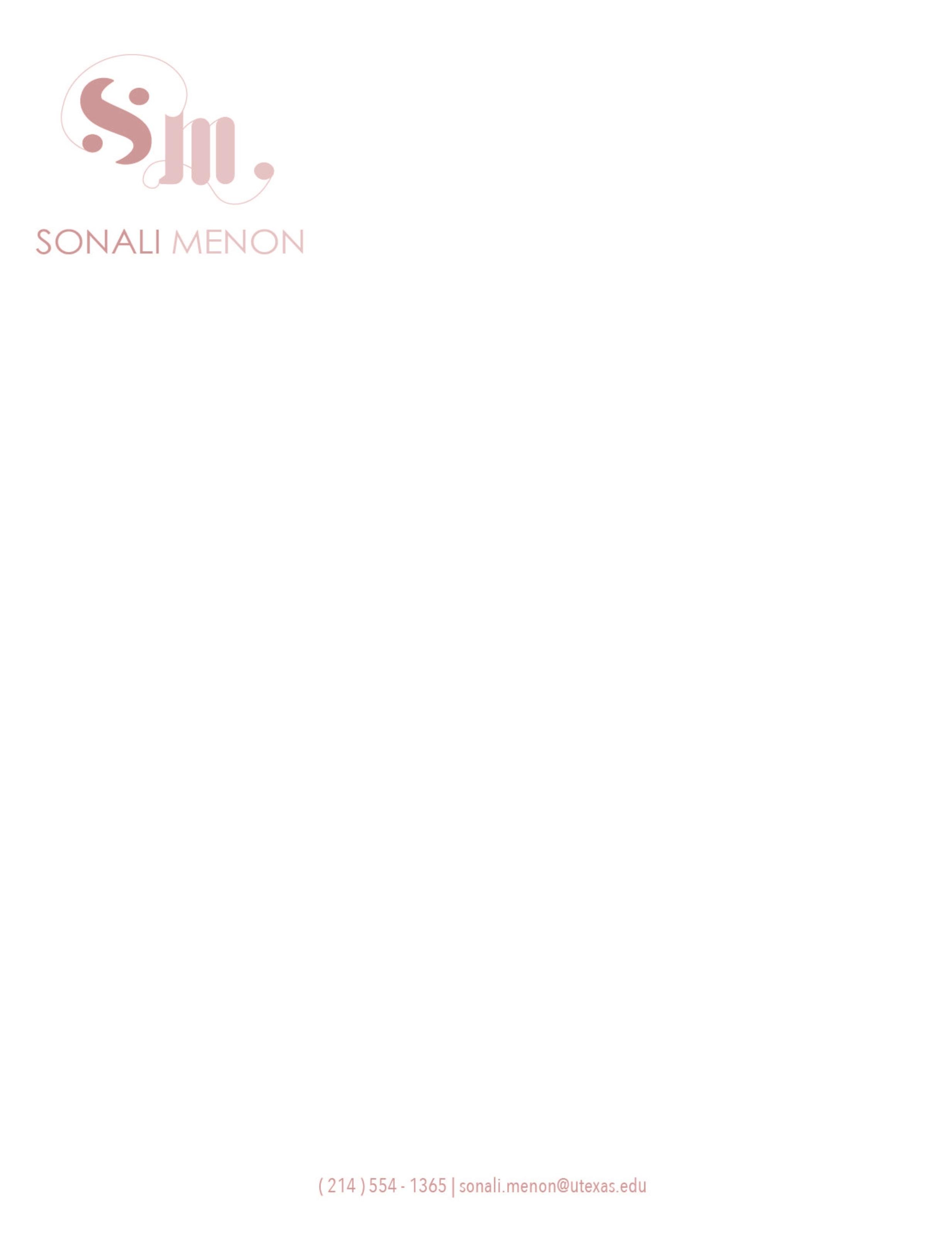
I used three similar fonts to create the hierarchy in my resume and cover letter. First, I used the font Hei Light for my title name on the resume because it is clean, and the cap height of the letters is tall and uniform. I also used this font for my name on the business cards and the letterhead. I also used Hei Light for my info line on all the components of my identity system. I did this because the info line always follows the title name, so I wanted them to look uniform and as if they came together in pairs. Then, I used fonts from the Avenir type family for the hierarchy on my resume. I chose to use the fonts from the Avenir family because they are sleek, modern, and sans serif, which fits the sophisticated and astral aesthetic of my identity system. For the headers of each section, I used Avenir Next Condensed in medium and all caps to make it stand out, as well as to conserve space to create room to list all my credentials. Next, I used Avenir Next in medium for the dates to match the header but in a less bold way. Then, I used Avenir Next in medium for the bullet points listing my responsibilities in each position and my skills list because it is the most readable font as the kerning was far enough to where the letters are easily distinguishable. I also used Avenir Next in regular for my cover letter. I used a 12-14 point type size for the resume’s body and made the leading 2-3 points greater than the type size to ensure that the document would have loose kerning.


