MISC.
MISC.
Here you will find all my past projects that divulge from the realm of writing and journalism.
Book cover redesign
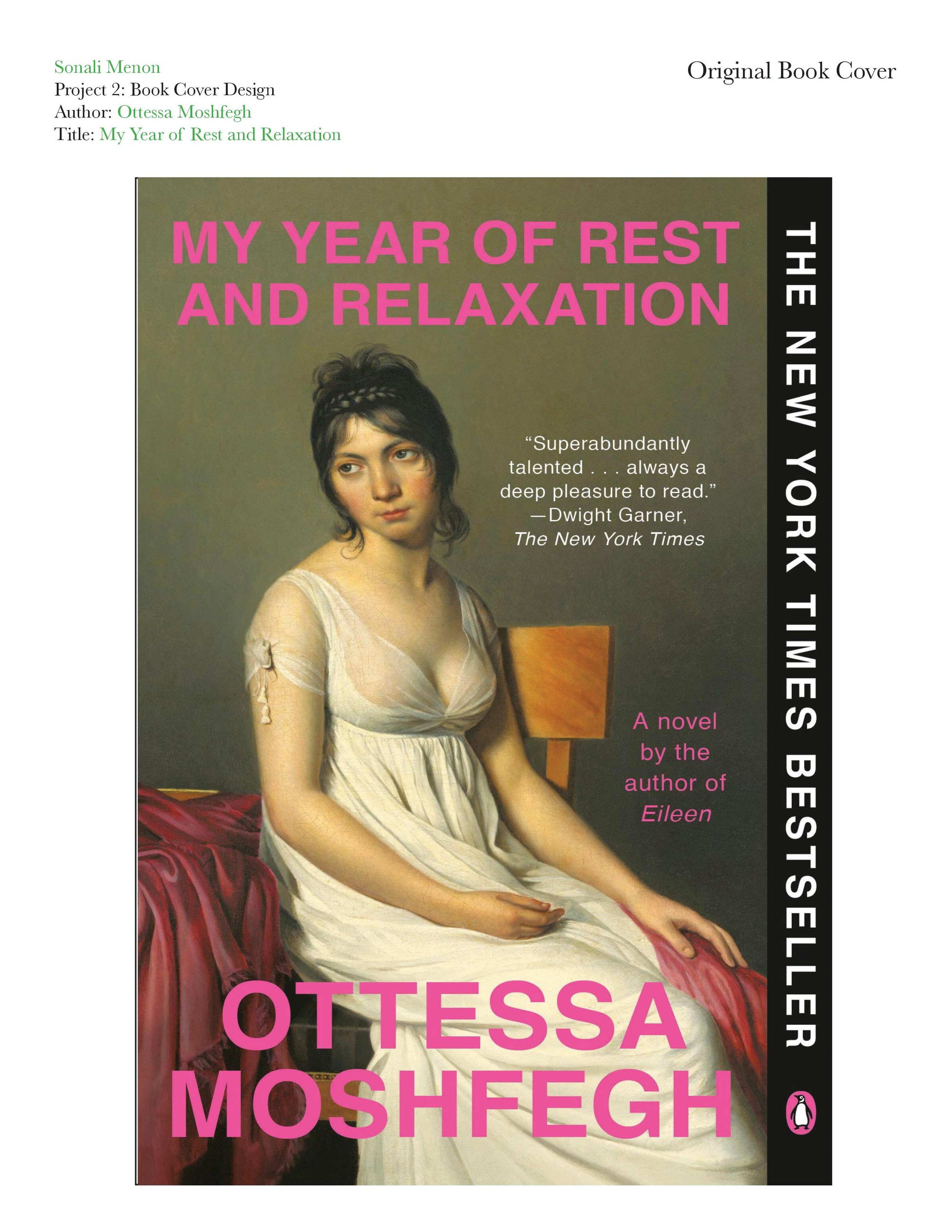
This project was done for a Graphic Design course at the University of Texas at Austin, wherein we were tasked with taking a book we were familiar with and redesigning the cover. I remade the cover of “My Year of Rest and Relaxation” by Ottessa Moshfegh for my redesign project. This book is near and dear to my heart and follows the story of an unreliable, unlikable, unnamed narrator who comes from a wealthy upper-eastside family. The book takes place in 2001 when the narrator has just graduated from college and lives alone in the Empire City. While she may be presented as perfectly enviable on the outside, our unnamed narrator is secretly miserable and in denial of her own misery. To “renew” herself and escape her sadness, the narrator devises a plan to sleep for a year through a self-induced coma, which is made possible by her finding the worst-reviewed psychiatrist in all of New York City and lying about her symptoms to receive a Chex mix variety of drugs.
While I don’t think the book’s original cover is unattractive in any way, I do not believe it represents the book. Lately, I have been noticing a trend in book covers that involves taking a seemingly random piece of old artwork and slapping the book title on it (e.g., “Serotonin” by Michael Houellebecq, “A Certain Hunger” by Chelsea G. Summers, etc.). The original cover features the neoclassical painting titled “The Portrait of A Young Woman in White” by Jacques-Louis David. I could not find an official reason why the original designer of the cover chose this specific painting. However, I think it may be because the woman in the painting has a tired and apathetic expression, similar to how the narrator is described. While it is a beautiful painting, I do not think it’s a fitting cover as it does not give potential readers a glimpse into the story.
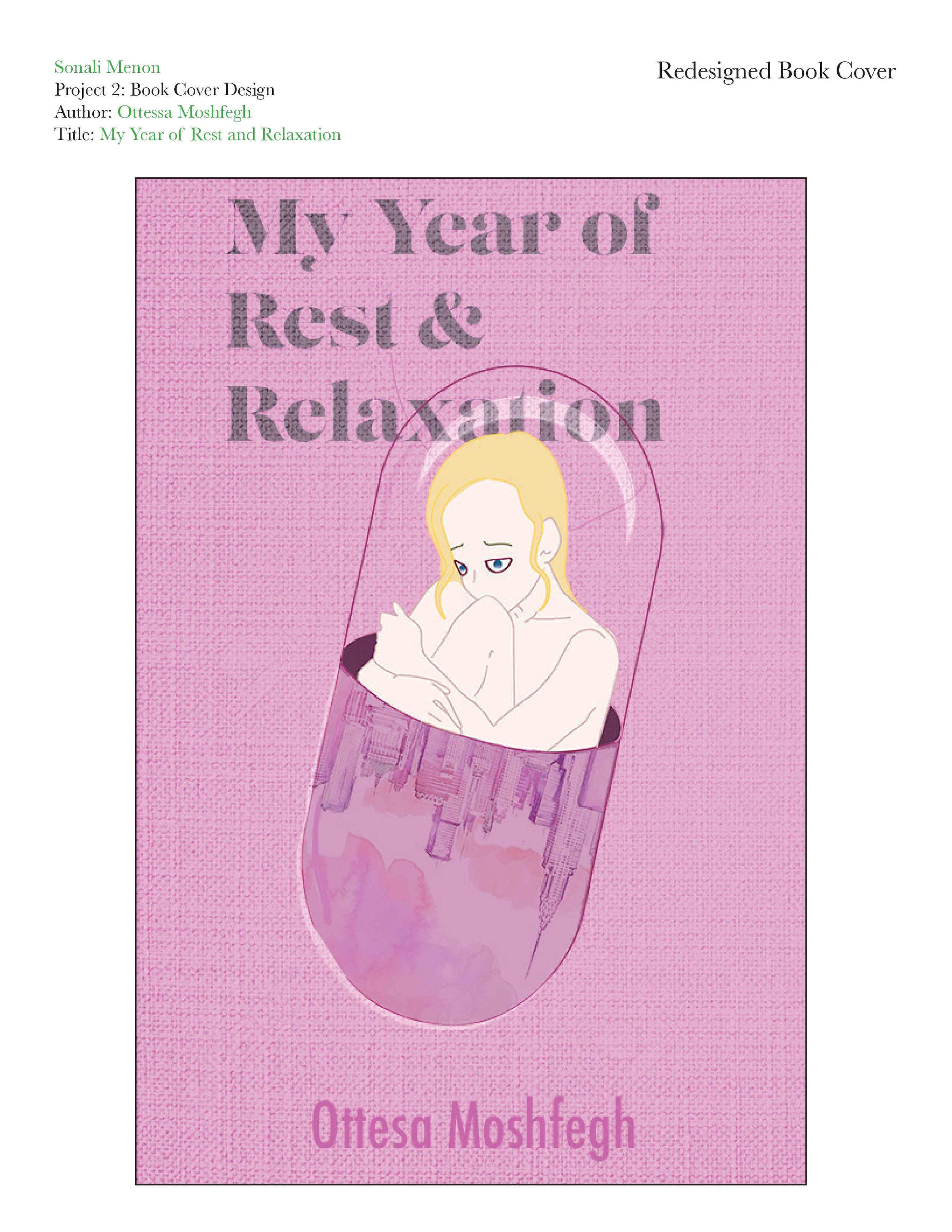
For my redesign, I wanted to combine the three central motifs of the book: Pills, sleep, and New York City. I first designed the central image of the girl hugging her knees on paper and then transferred it into Adobe Illustrator to create the line work. The final image is meant to show a girl trapped inside a pill. I colored the image in Illustrator and Photoshop. I wanted one half of the pill to represent the book’s narrator and the other half to illustrate New York City’s skyline. I wanted these two components to be side-by-side because the narrator describes her persona as an extension of the city’s culture in the early 2000s. I wanted her to be trapped in the pill to represent how she becomes trapped in a cycle of drug addiction in her quest to become a new person through pill-induced sleep. I found a watercolor image of the New York City skyline on Pinterest that I thought would be good to incorporate into my design. I used the combination and manipulation methods of Photoshop intervention to multiply and blend the skyline image into the bottom half of the pill and shape it into a semi-ellipse shape. I chose this particular painting because it had a lot of pink and nude tones to it and was made with watercolor paints, which creates a dreamy, feminine look to it, which I felt to be fitting for the book as the narrator operates through a dreamlike dissociation towards the end of the novel.
The original book cover had the title and the author’s name in bright pink sans-serif text. The narrator is also described as liking pink, so I thought it was important to incorporate different shades of pink into the cover design. Also, I chose to depict the narrator as blonde because it is a physical characteristic she defines herself with. Then, I found a photo of a light glare on glass and used Photoshop to combine it with the top of my pill design to create the look of the narrator trapped in a translucent glass pill that may shatter if she ever does break out of her addiction. I imagined the book to be printed on textured material, so I found a photo of a blank, white stretched canvas and blended it into the layers of my design to create a textured look.
I used LustDisplay as the title font because of its girly, vintage look. To reinforce the dreamy look I accomplished through the watercolor skyline, I put a Gaussian blur effect on the text, increased the noise on the font, and added a ripple effect. I attempted to recreate the look of Xerox photocopy print onto the font as it is reminiscent of the early 2000s. The font of the author’s name is a simple sans-serif font called Futura, which I thought was similar to the font on the original cover.
Cause poster design


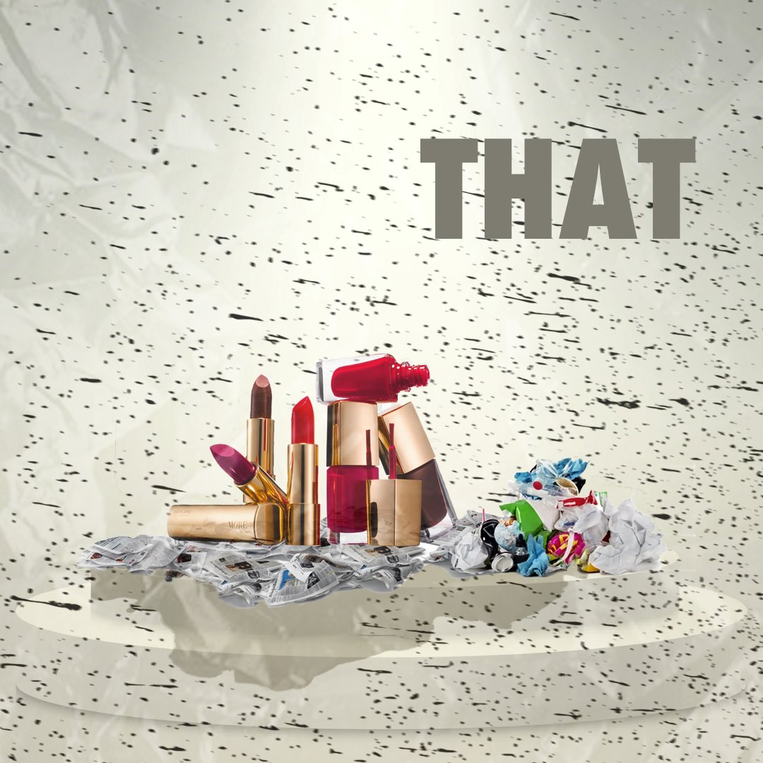
This project was made for a graphic design course I took in my sophomore year at the University of Texas at Austin. We were tasked with creating a poster showcasing a social, political, or environmental issue that we want to bring awareness to. I chose to make my poster about cosmetic waste and its impact on the environment. To create this poster I used Adobe Photoshop and InDesign.

