MISC.
MISC.
Here you will find all my past projects that divulge from the realm of writing and journalism.
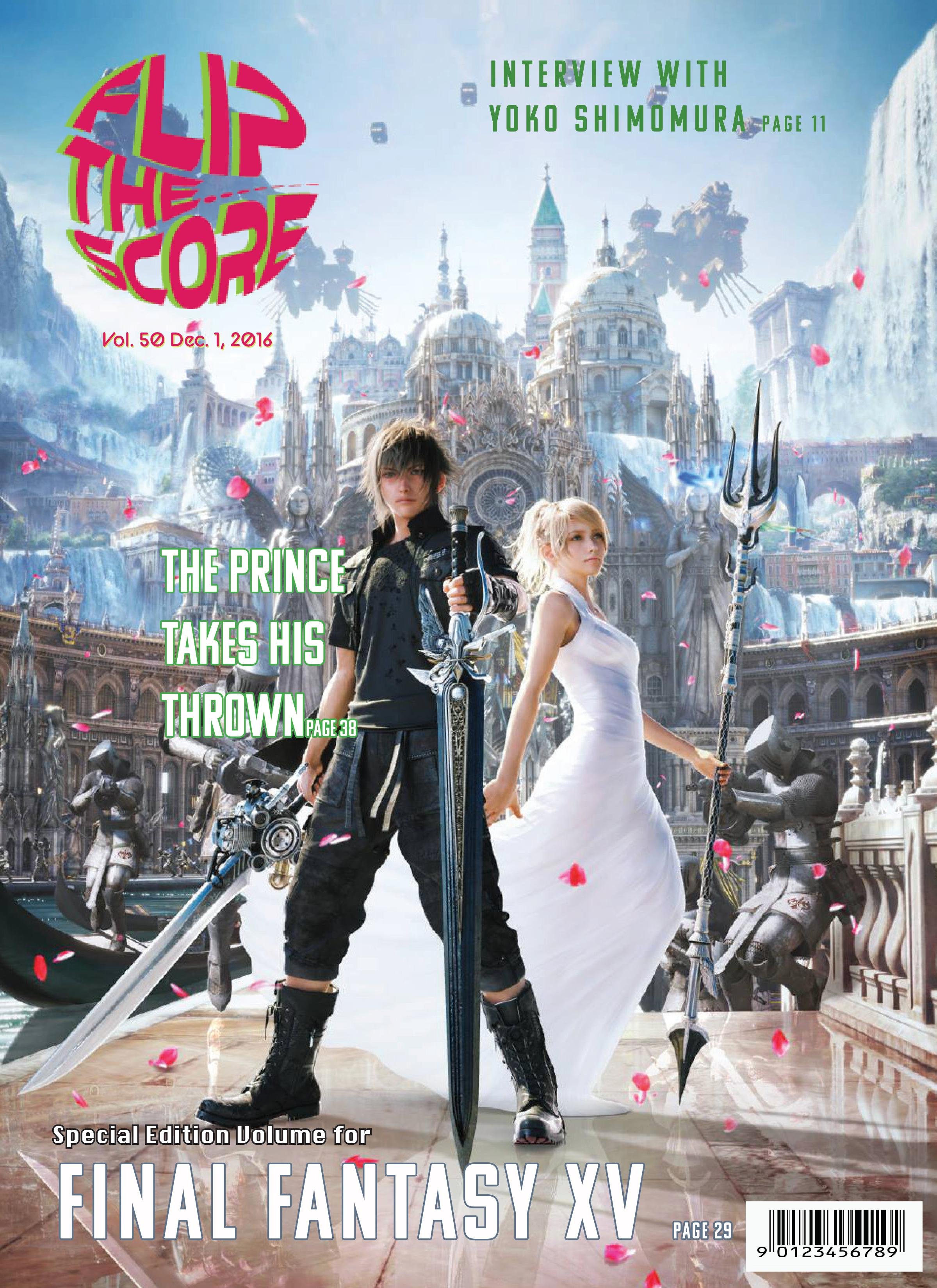
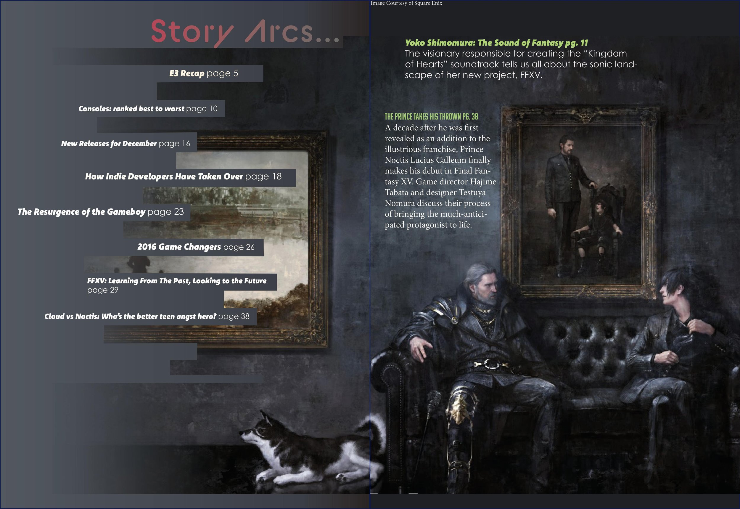
Fictional magazine cover and table of contents
This project was for a Graphic Design course at the University of Texas at Austin. Our assignment was to conceptualize a fictional magazine focusing on a topic of our choosing and design a logo, magazine cover, and table of contents spread for it. I created a new-generation video game publication called "Flip the Score." I chose to do this because I haven't seen many magazines focused on video games before. My all-time favorite video game is "Final Fantasy XV," released November 29, 2016. So, I was inspired by existing entertainment magazines that mainly publish celebrity features or trend reports and refurbish them to suit the demographic and interests of video game enthusiasts. For this project, I pretended it was December 2016, FFXV had just been released, and "Flip the Score" was dedicating that month's issue to featuring it. I titled the magazine "Flip the Score" because that's a retro slang word used in arcades when a player maxes out the scoreboard, causing the point number in the game to revert back to zero.
Since video games are often associated with younger people, I wanted to make the design of the cover and the colors used to be more vivid, exciting, and youthful. For the logo, I wanted to make it look like a sticker that one may see on the cover of a CD box. I created a wavy, circular shape in Adobe Illustrator and used the enveloping tool to warp my text into that drawn shape to create this aesthetic. The colors I featured on the logo are yellow-green because it's reminiscent of the old-school digital type seen in the world's first video games, and red-purple since it's a bright, complementary color. I wanted these colors to flow throughout the layout to create a brand and make the design more cohesive. For this reason, I also used these same or similar colors for the article titles in the table of contents.
For the font hierarchy, I used BC Alphapipe for the logo and the table of contents header. For the article titles on the magazine cover, I used Komet and Kamu. I used Komet for most of the title names and Century Gothic Pro for the page numbers of the articles on the table of contents. I chose these specific sans serif fonts because they have a futuristic, clean look, which I felt fits the video game theme.
I used a 5x5 grid in Adobe InDesign for the cover to help me create the layout. I chose the cover photo because I felt it was a very dynamic and exciting photo that would generate excitement within the audience for the game's release and create interest in picking up the magazine from shelves. However, this photo did present an issue when choosing colors for the article titles as the image possesses many highly saturated colors, making it difficult to make the text readable and avoid creating a busy look. I wanted the table of contents to be calmer than the cover to showcase the duality in the game's tone and offer the reader visual variety. I used a piece of art created by the game's developers and spread it across two pages. On the left side, I used the pen tool to create a custom frame to create lines wherein my article could lay. The right side is where most of the weight of the photo is, and I chose not to include the text so readers can focus on the game's main characters. I also created a gradation of the image on the left side of the spread to make it look like it is fading from existence, which fits the tone of the painting and the game, and this also made the composition look smoother and allowed the titles to better blend in.

