MISC.
MISC.
Here you will find all my past projects that divulge from the realm of writing and journalism.
Fictional magazine spread design
This project was a continuation of my fictional magazine cover project. For it, we were tasked with taking either a fake or existing article related to the topic of interest of our initial magazine cover and designing a layout spread for it.
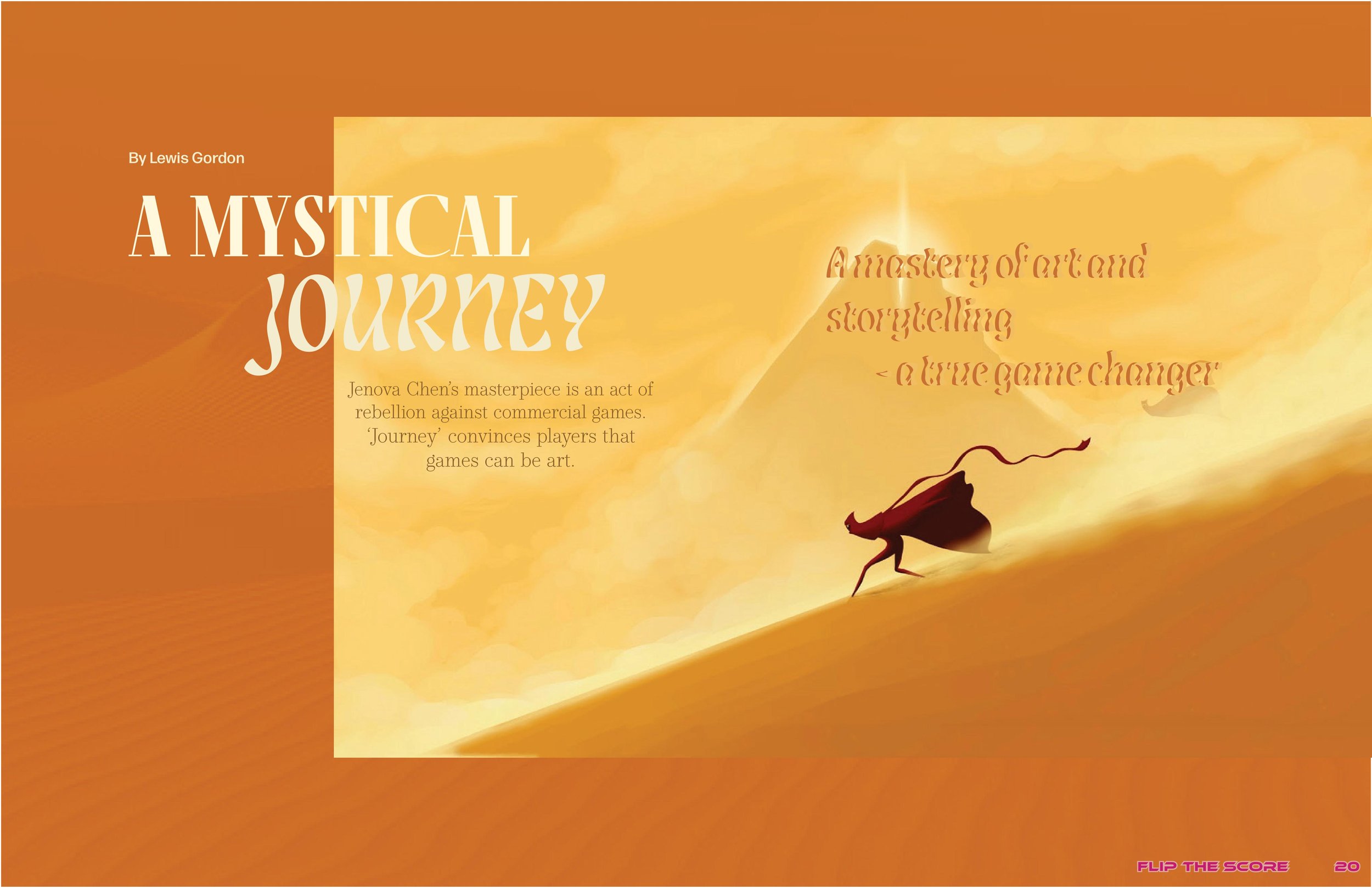
When creating this magazine spread, I did regret my choice to make a video game magazine. While looking at examples of video game magazine spreads to research their general themes before starting my project, I realized that they usually follow a formulaic and dated layout template. I wanted to create something more highbrow and unique, so I stuck to the video game theme but strayed away slightly from the impression my cover in the previous project might have suggested. In this layout, I am pretending that this is an earlier edition of “Flip the Score” (the name of my fictional magazine) from around 2014 when the video game “Journey” was released. Like my concept for the previous cover project, this edition of “Flip the Score” is dedicated to “Journey,” so the table of contents would ideally be designed to reflect the vibe and motifs of the dame, like how my previous cover and table of contents project captured the general themes of “Final Fantasy XV.” I chose to focus this spread on “Journey” because it is a game famous for its unique art style, so I thought making it the focus of my design would allow me to elevate my design to be more creative and sophisticated.
I used a 3x5 grid for the design in Adobe InDesign and wanted to make my layout more geometric to contradict the bohemian nature of the game’s artwork. I wanted all the focus on the first two pages of the spread to be the image pulled from the game because it’s a very dynamic image that I believe would hook the reader. I made the picture confine two rows of the grid and jump the gutter because the main subject of the photo is gliding towards the left of the image. Jumping the gutter to the left side was made to mimic this movement and add a sense of continuation to the design.
For the background, I pulled a dark orange from the focal image and then overlayed a picture of a desert. Then, I used the soft burn effect to create a subtle texture miming the sand in the focal image.
For the article title, I used a combination of Fino and Lisbeth Display fonts. I chose Fino because it possesses an air of sophistication, and it draws the reader in with its boldness as a serif font in all caps. I decided to pair it with Lisbeth Display because it mimics the appearance of a heat mirage one would see isolated in the middle of the desert. I also used Lisbeth Display for all the pull quotes on the right-hand side and layered two colors to give the text more dimension and increase its readability. I pulled the color of all the fonts from the focal image. I used the font Form DJR Micro — a straightforward and easy-to-read sans serif font — for the byline. I used the same font for the body copy in the second spread, which features the actual article. For the blurb, I chose to type it in an oval formation using the type path tool as a call back to the game’s narrative structure, which is very cyclical and has a very organic feel. Incorporating ellipticals and circular motifs throughout my design would help convey this atmosphere while adding some visual interest. The font used for the blurb is Operetta 8, a serif font similar to but more subdued than Fino.
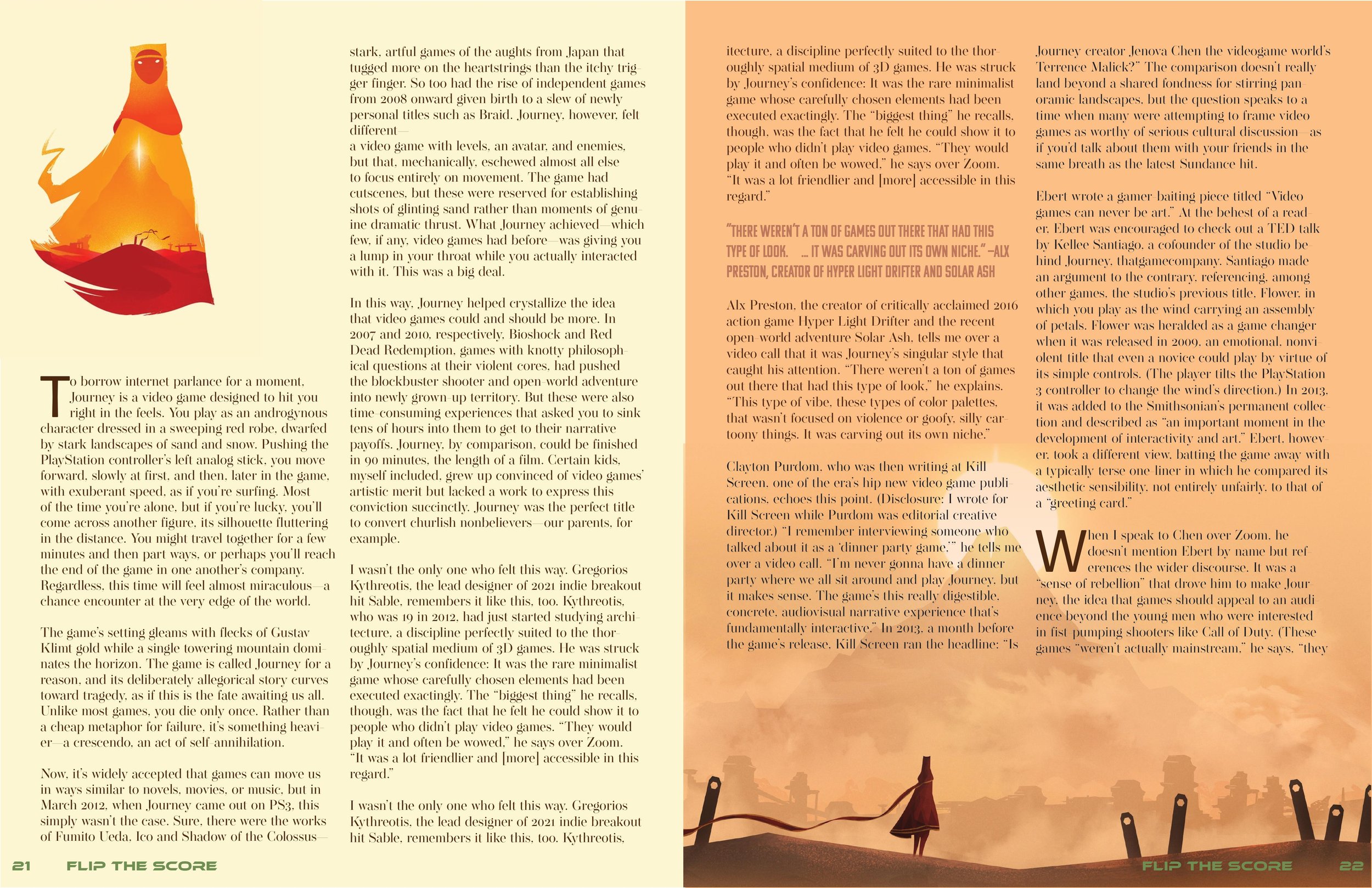
I wanted to mimic the first spread by incorporating more circle motifs and jumping the gutter on my images for the second spread. I kept the layout very simple so readers could focus on the article and pictures from the game. “Journey’s” atmosphere is relaxed, so I wanted to convey that in my spread. The color palettes between the two pages are different, with the first being orange and the second being cream yellow. These color palettes were pulled from each spread’s focal images to create a cohesive layout. I chose to do this to create a color block look that gives a youthful look to the design and relates to the magazine’s brand as it is a video game magazine targeted towards a young audience.
For grid use, I split the article into two columns on the left-hand side of the spread to put more content on the page and create a subtly geometric look. However, I didn’t want the design to be symmetrical because I felt it would detract from the whimsical tone I wanted to create. So, I made the right-hand side bigger by placing a wider column within the bounds of the rightmost image. The color of the body copy is dark brown and pulled from the left-most image. I also incorporated the circle motifs from the first spread by creating more pull quotes and oval frames for images.

