MISC.
MISC.
Here you will find all my past projects that divulge from the realm of writing and journalism.
Coding final: Queen band site
Entering my senior year of college I had one major goal in mind to savor my last moments at UT Austin: Learn as many new skills as possible. For the prior 3 years of college I had solely focused my attention to reporting and writing, which is ultimately where my passion lies, but I am hyper cognizant of the fact that the landscape of journalism is rapidly evolving. Now more then ever, people are receiving their information in digital markets whether that means official newspaper websites or social media trending pages. For that reason, I wanted to try my hand in coding. As a journalist, not only is it important to write information but also to disseminate it through efficient channels. I was able to enroll in professor Christian McDonald’s Coding for Journalists course and learned many valuable skills in website building that I believe I will carry for the rest of my career as a journalist. Through this class I learned how to write code in HTML, CSS and JavaScript as well as how to share my work through digital means and create engaging online platforms that appeals to news consumers.
For the final project in my class we had the choice to either make a site advertising the band Queen or a travel guide site for the city of Austin. As a Queen fan, I gladly chose the former option. This project combined all the skills I had learned over the semester, allowing me to create a functional, multi-page and engaging site from scratch.
HTML and CSS
I got the opportunity to learn HTML and CSS in a course at UT Austin called Coding for Journalists taught by Christian McDonald and this assignment was made to show mastery of my skills in coding a website page for a journalism story online.
Book cover redesign
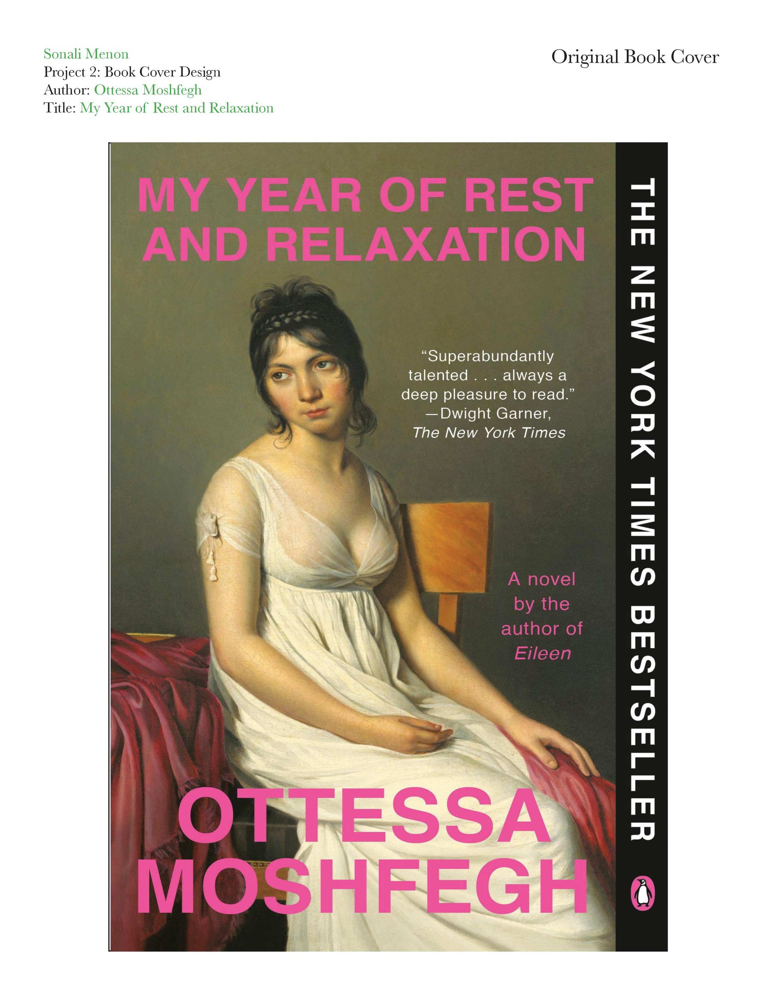

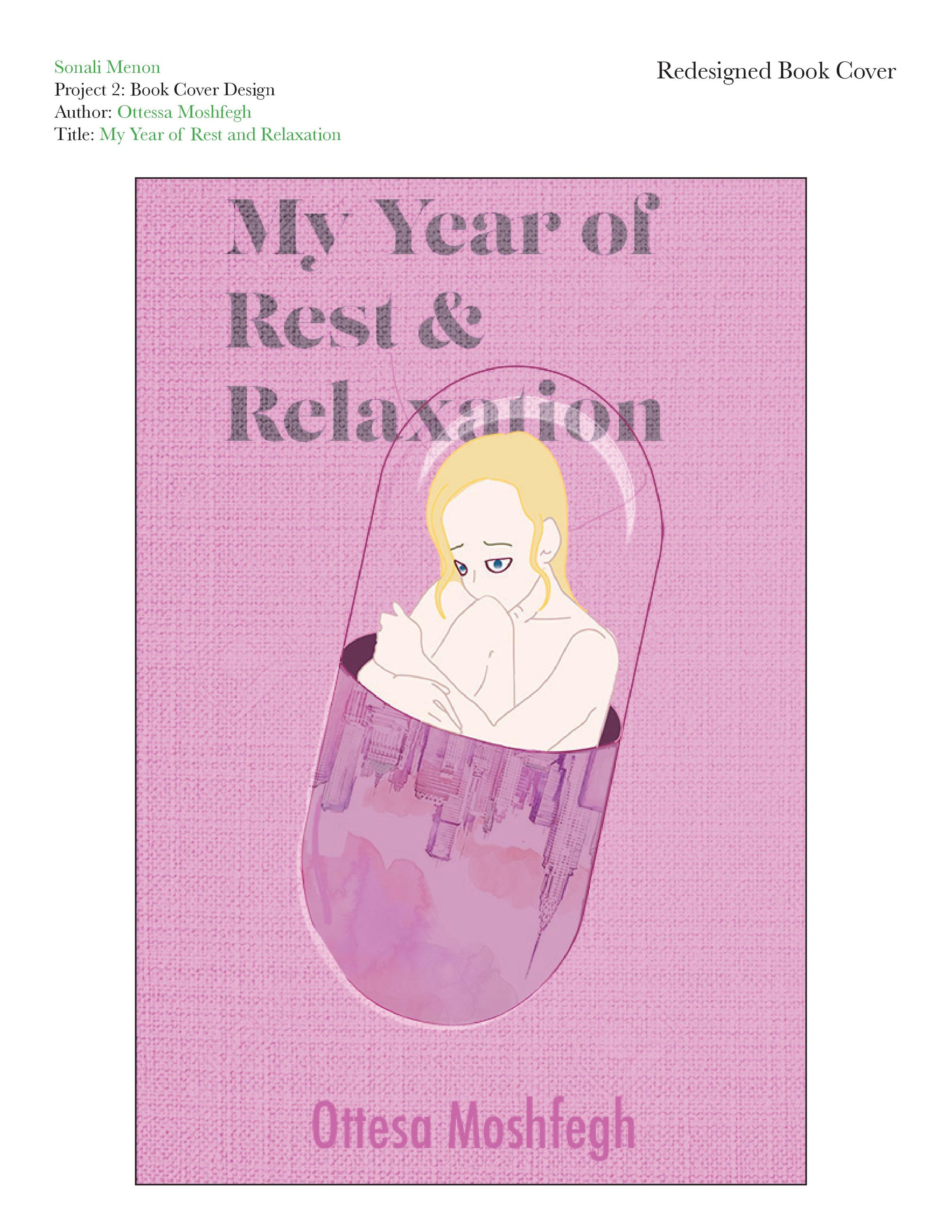
This project was done for a Graphic Design course at the University of Texas at Austin, wherein we were tasked with taking a book we were familiar with and redesigning the cover. I remade the cover of “My Year of Rest and Relaxation” by Ottessa Moshfegh for my redesign project. This book is near and dear to my heart and follows the story of an unreliable, unlikable, unnamed narrator who comes from a wealthy upper-eastside family. The book takes place in 2001 when the narrator has just graduated from college and lives alone in the Empire City. While she may be presented as perfectly enviable on the outside, our unnamed narrator is secretly miserable and in denial of her own misery. To “renew” herself and escape her sadness, the narrator devises a plan to sleep for a year through a self-induced coma, which is made possible by her finding the worst-reviewed psychiatrist in all of New York City and lying about her symptoms to receive a Chex mix variety of drugs.
While I don’t think the book’s original cover is unattractive in any way, I do not believe it represents the book. Lately, I have been noticing a trend in book covers that involves taking a seemingly random piece of old artwork and slapping the book title on it (e.g., “Serotonin” by Michael Houellebecq, “A Certain Hunger” by Chelsea G. Summers, etc.). The original cover features the neoclassical painting titled “The Portrait of A Young Woman in White” by Jacques-Louis David. I could not find an official reason why the original designer of the cover chose this specific painting. However, I think it may be because the woman in the painting has a tired and apathetic expression, similar to how the narrator is described. While it is a beautiful painting, I do not think it’s a fitting cover as it does not give potential readers a glimpse into the story.
For my redesign, I wanted to combine the three central motifs of the book: Pills, sleep, and New York City. I first designed the central image of the girl hugging her knees on paper and then transferred it into Adobe Illustrator to create the line work. The final image is meant to show a girl trapped inside a pill. I colored the image in Illustrator and Photoshop. I wanted one half of the pill to represent the book’s narrator and the other half to illustrate New York City’s skyline. I wanted these two components to be side-by-side because the narrator describes her persona as an extension of the city’s culture in the early 2000s. I wanted her to be trapped in the pill to represent how she becomes trapped in a cycle of drug addiction in her quest to become a new person through pill-induced sleep. I found a watercolor image of the New York City skyline on Pinterest that I thought would be good to incorporate into my design. I used the combination and manipulation methods of Photoshop intervention to multiply and blend the skyline image into the bottom half of the pill and shape it into a semi-ellipse shape. I chose this particular painting because it had a lot of pink and nude tones to it and was made with watercolor paints, which creates a dreamy, feminine look to it, which I felt to be fitting for the book as the narrator operates through a dreamlike dissociation towards the end of the novel.
The original book cover had the title and the author’s name in bright pink sans-serif text. The narrator is also described as liking pink, so I thought it was important to incorporate different shades of pink into the cover design. Also, I chose to depict the narrator as blonde because it is a physical characteristic she defines herself with. Then, I found a photo of a light glare on glass and used Photoshop to combine it with the top of my pill design to create the look of the narrator trapped in a translucent glass pill that may shatter if she ever does break out of her addiction. I imagined the book to be printed on textured material, so I found a photo of a blank, white stretched canvas and blended it into the layers of my design to create a textured look.
I used LustDisplay as the title font because of its girly, vintage look. To reinforce the dreamy look I accomplished through the watercolor skyline, I put a Gaussian blur effect on the text, increased the noise on the font, and added a ripple effect. I attempted to recreate the look of Xerox photocopy print onto the font as it is reminiscent of the early 2000s. The font of the author’s name is a simple sans-serif font called Futura, which I thought was similar to the font on the original cover.
Cause poster design
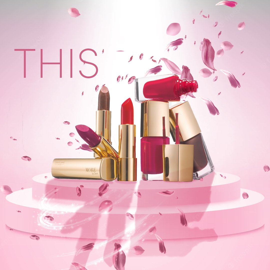
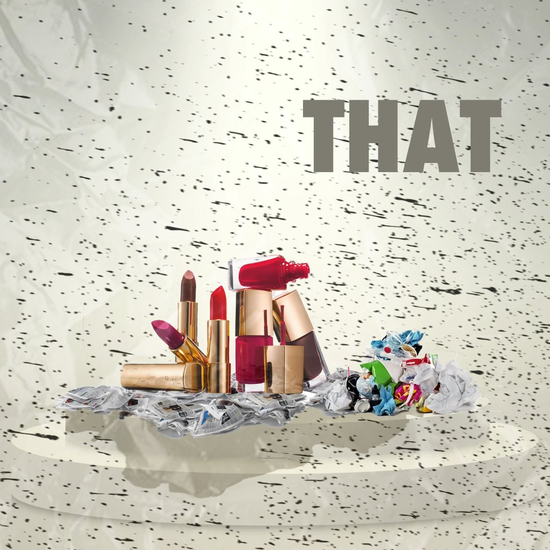
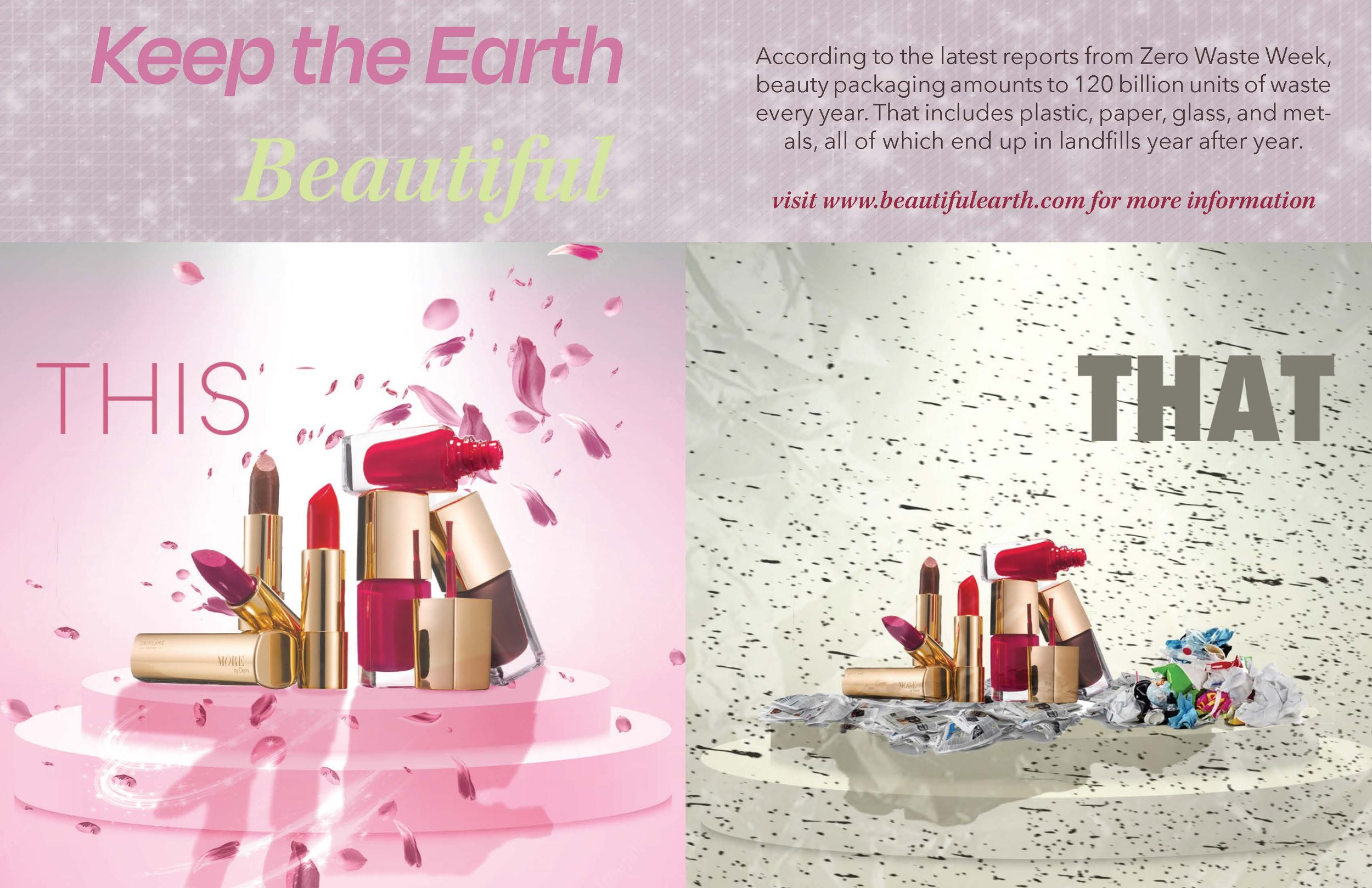
This project was made for a graphic design course I took in my sophomore year at the University of Texas at Austin. We were tasked with creating a poster showcasing a social, political, or environmental issue that we want to bring awareness to. I chose to make my poster about cosmetic waste and its impact on the environment. To create this poster I used Adobe Photoshop and InDesign.
Graphic design portfolio
It all begins with an idea.


As the spring semester of my sophomore year comes to a close I am very sad to say goodbye to my graphic design class. I have compiled all of my projects from my class to create this digitally accessible version of my graphic design portfolio. Before this class I had no experience with Adobe Illustrator or InDesign and only very limited experience in PhotoShop, but I believe I have gained a vast amount of knowledge in design through this course.
For additional information on each individual item shown in this portfolio please refer to these links which will lead you to blog posts focused on each piece:
Fictional magazine spread design

This project was a continuation of my fictional magazine cover project. For it, we were tasked with taking either a fake or existing article related to the topic of interest of our initial magazine cover and designing a layout spread for it.
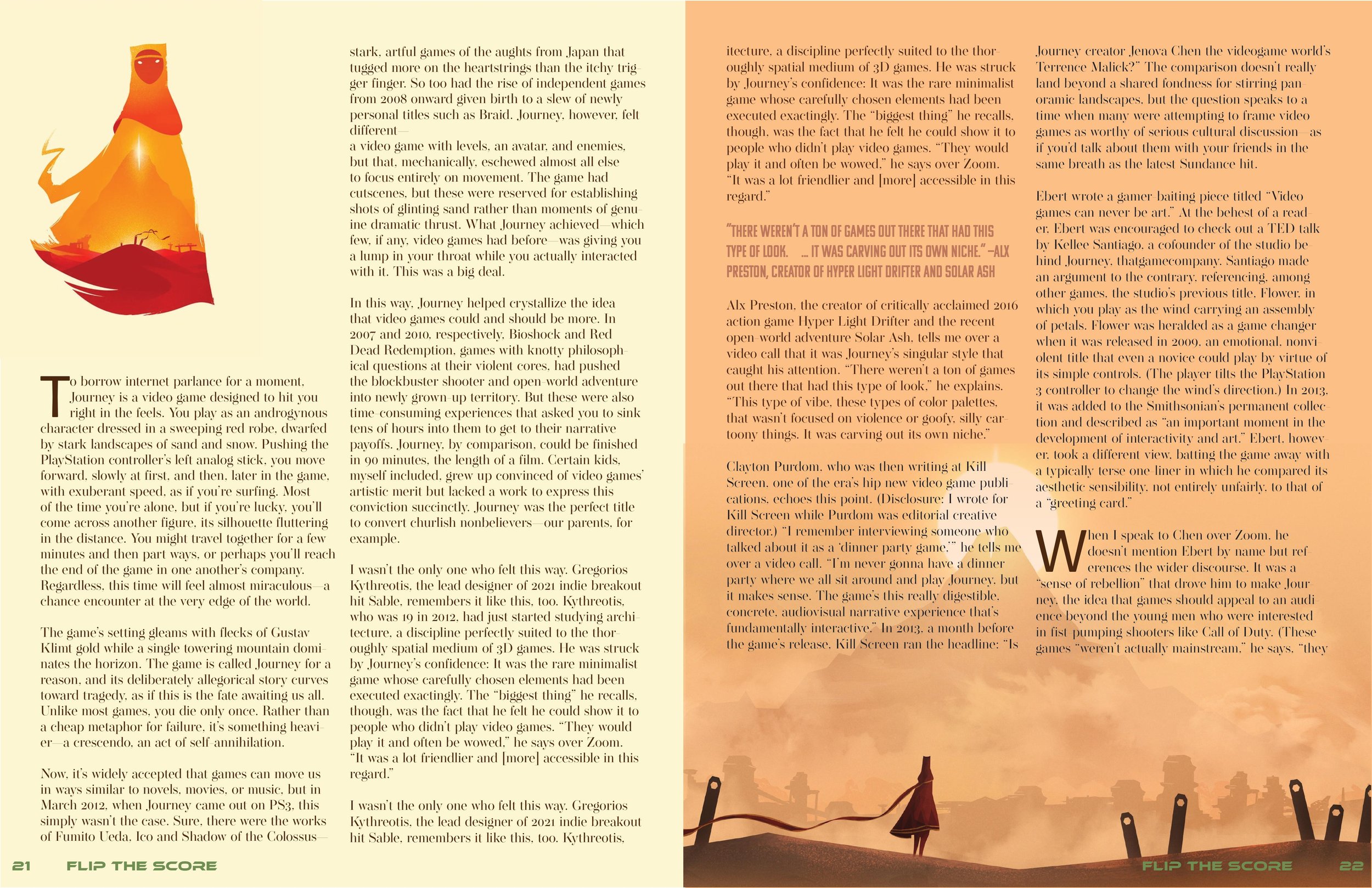
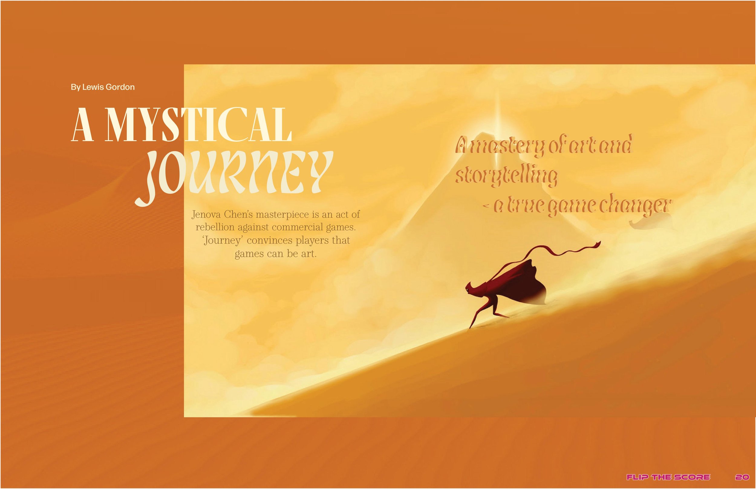
When creating this magazine spread, I did regret my choice to make a video game magazine. While looking at examples of video game magazine spreads to research their general themes before starting my project, I realized that they usually follow a formulaic and dated layout template. I wanted to create something more highbrow and unique, so I stuck to the video game theme but strayed away slightly from the impression my cover in the previous project might have suggested. In this layout, I am pretending that this is an earlier edition of “Flip the Score” (the name of my fictional magazine) from around 2014 when the video game “Journey” was released. Like my concept for the previous cover project, this edition of “Flip the Score” is dedicated to “Journey,” so the table of contents would ideally be designed to reflect the vibe and motifs of the dame, like how my previous cover and table of contents project captured the general themes of “Final Fantasy XV.” I chose to focus this spread on “Journey” because it is a game famous for its unique art style, so I thought making it the focus of my design would allow me to elevate my design to be more creative and sophisticated.
I used a 3x5 grid for the design in Adobe InDesign and wanted to make my layout more geometric to contradict the bohemian nature of the game’s artwork. I wanted all the focus on the first two pages of the spread to be the image pulled from the game because it’s a very dynamic image that I believe would hook the reader. I made the picture confine two rows of the grid and jump the gutter because the main subject of the photo is gliding towards the left of the image. Jumping the gutter to the left side was made to mimic this movement and add a sense of continuation to the design.
For the background, I pulled a dark orange from the focal image and then overlayed a picture of a desert. Then, I used the soft burn effect to create a subtle texture miming the sand in the focal image.
For the article title, I used a combination of Fino and Lisbeth Display fonts. I chose Fino because it possesses an air of sophistication, and it draws the reader in with its boldness as a serif font in all caps. I decided to pair it with Lisbeth Display because it mimics the appearance of a heat mirage one would see isolated in the middle of the desert. I also used Lisbeth Display for all the pull quotes on the right-hand side and layered two colors to give the text more dimension and increase its readability. I pulled the color of all the fonts from the focal image. I used the font Form DJR Micro — a straightforward and easy-to-read sans serif font — for the byline. I used the same font for the body copy in the second spread, which features the actual article. For the blurb, I chose to type it in an oval formation using the type path tool as a call back to the game’s narrative structure, which is very cyclical and has a very organic feel. Incorporating ellipticals and circular motifs throughout my design would help convey this atmosphere while adding some visual interest. The font used for the blurb is Operetta 8, a serif font similar to but more subdued than Fino.
I wanted to mimic the first spread by incorporating more circle motifs and jumping the gutter on my images for the second spread. I kept the layout very simple so readers could focus on the article and pictures from the game. “Journey’s” atmosphere is relaxed, so I wanted to convey that in my spread. The color palettes between the two pages are different, with the first being orange and the second being cream yellow. These color palettes were pulled from each spread’s focal images to create a cohesive layout. I chose to do this to create a color block look that gives a youthful look to the design and relates to the magazine’s brand as it is a video game magazine targeted towards a young audience.
For grid use, I split the article into two columns on the left-hand side of the spread to put more content on the page and create a subtly geometric look. However, I didn’t want the design to be symmetrical because I felt it would detract from the whimsical tone I wanted to create. So, I made the right-hand side bigger by placing a wider column within the bounds of the rightmost image. The color of the body copy is dark brown and pulled from the left-most image. I also incorporated the circle motifs from the first spread by creating more pull quotes and oval frames for images.
Fictional magazine cover and table of contents
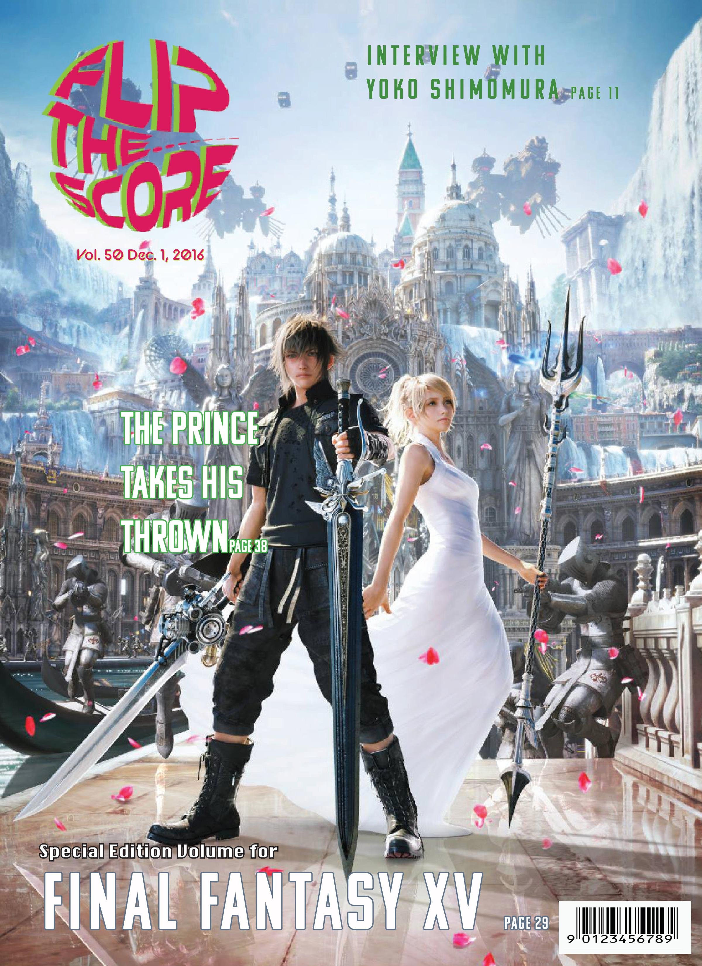
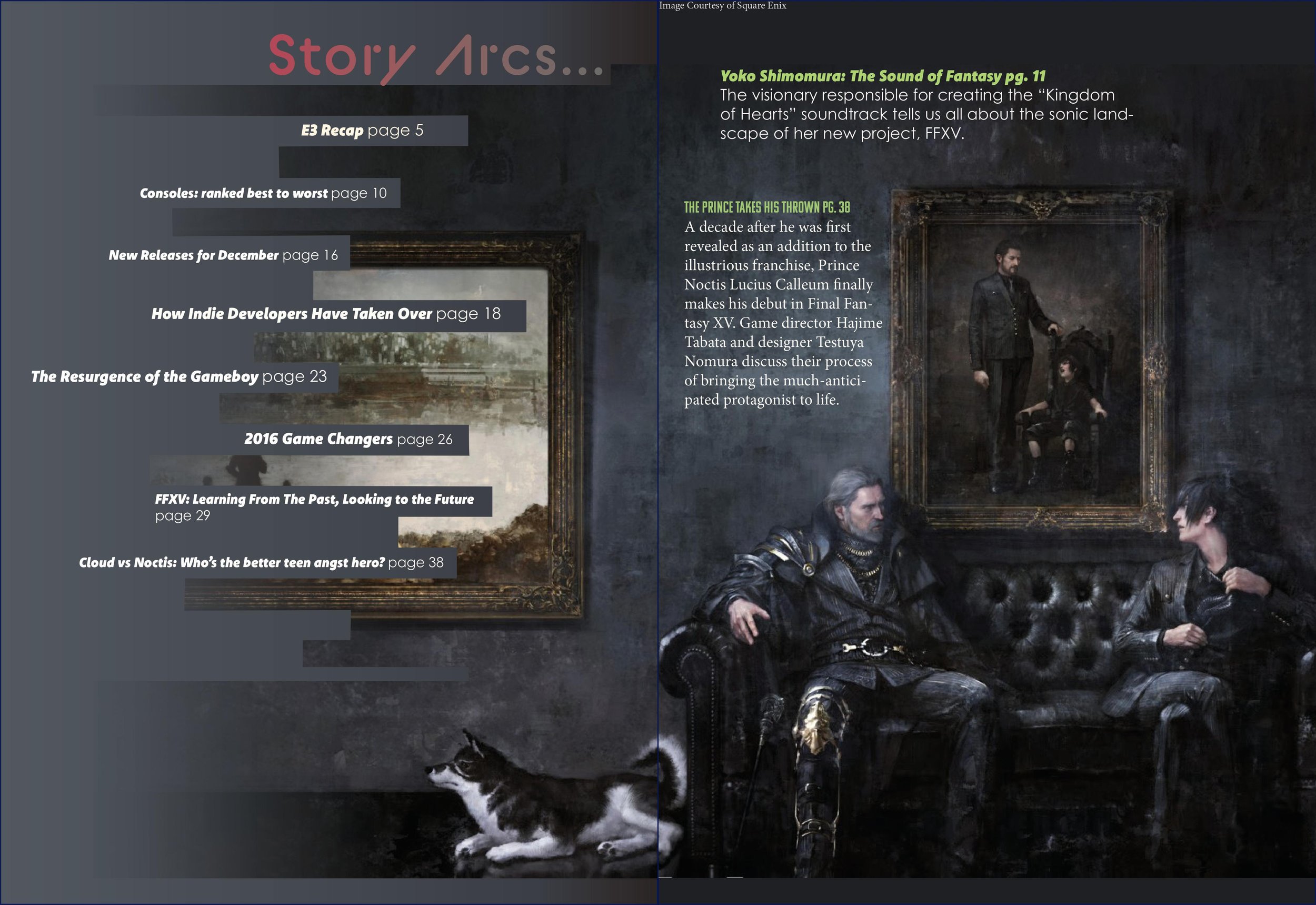
This project was for a Graphic Design course at the University of Texas at Austin. Our assignment was to conceptualize a fictional magazine focusing on a topic of our choosing and design a logo, magazine cover, and table of contents spread for it. I created a new-generation video game publication called "Flip the Score." I chose to do this because I haven't seen many magazines focused on video games before. My all-time favorite video game is "Final Fantasy XV," released November 29, 2016. So, I was inspired by existing entertainment magazines that mainly publish celebrity features or trend reports and refurbish them to suit the demographic and interests of video game enthusiasts. For this project, I pretended it was December 2016, FFXV had just been released, and "Flip the Score" was dedicating that month's issue to featuring it. I titled the magazine "Flip the Score" because that's a retro slang word used in arcades when a player maxes out the scoreboard, causing the point number in the game to revert back to zero.
Since video games are often associated with younger people, I wanted to make the design of the cover and the colors used to be more vivid, exciting, and youthful. For the logo, I wanted to make it look like a sticker that one may see on the cover of a CD box. I created a wavy, circular shape in Adobe Illustrator and used the enveloping tool to warp my text into that drawn shape to create this aesthetic. The colors I featured on the logo are yellow-green because it's reminiscent of the old-school digital type seen in the world's first video games, and red-purple since it's a bright, complementary color. I wanted these colors to flow throughout the layout to create a brand and make the design more cohesive. For this reason, I also used these same or similar colors for the article titles in the table of contents.
For the font hierarchy, I used BC Alphapipe for the logo and the table of contents header. For the article titles on the magazine cover, I used Komet and Kamu. I used Komet for most of the title names and Century Gothic Pro for the page numbers of the articles on the table of contents. I chose these specific sans serif fonts because they have a futuristic, clean look, which I felt fits the video game theme.
I used a 5x5 grid in Adobe InDesign for the cover to help me create the layout. I chose the cover photo because I felt it was a very dynamic and exciting photo that would generate excitement within the audience for the game's release and create interest in picking up the magazine from shelves. However, this photo did present an issue when choosing colors for the article titles as the image possesses many highly saturated colors, making it difficult to make the text readable and avoid creating a busy look. I wanted the table of contents to be calmer than the cover to showcase the duality in the game's tone and offer the reader visual variety. I used a piece of art created by the game's developers and spread it across two pages. On the left side, I used the pen tool to create a custom frame to create lines wherein my article could lay. The right side is where most of the weight of the photo is, and I chose not to include the text so readers can focus on the game's main characters. I also created a gradation of the image on the left side of the spread to make it look like it is fading from existence, which fits the tone of the painting and the game, and this also made the composition look smoother and allowed the titles to better blend in.
Identity system design
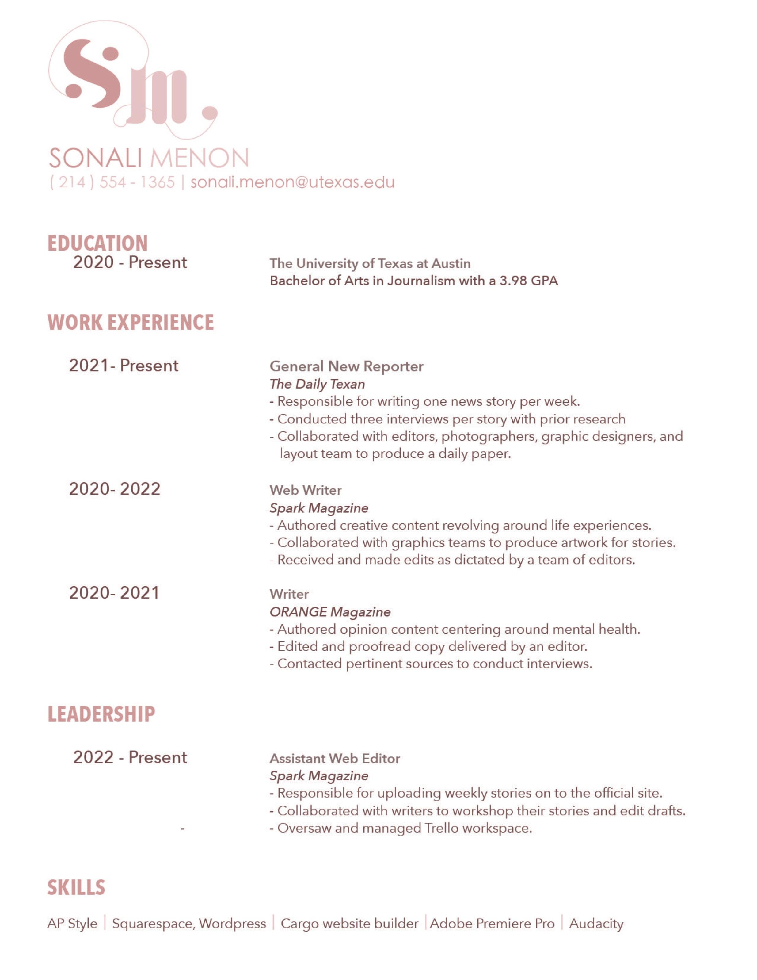
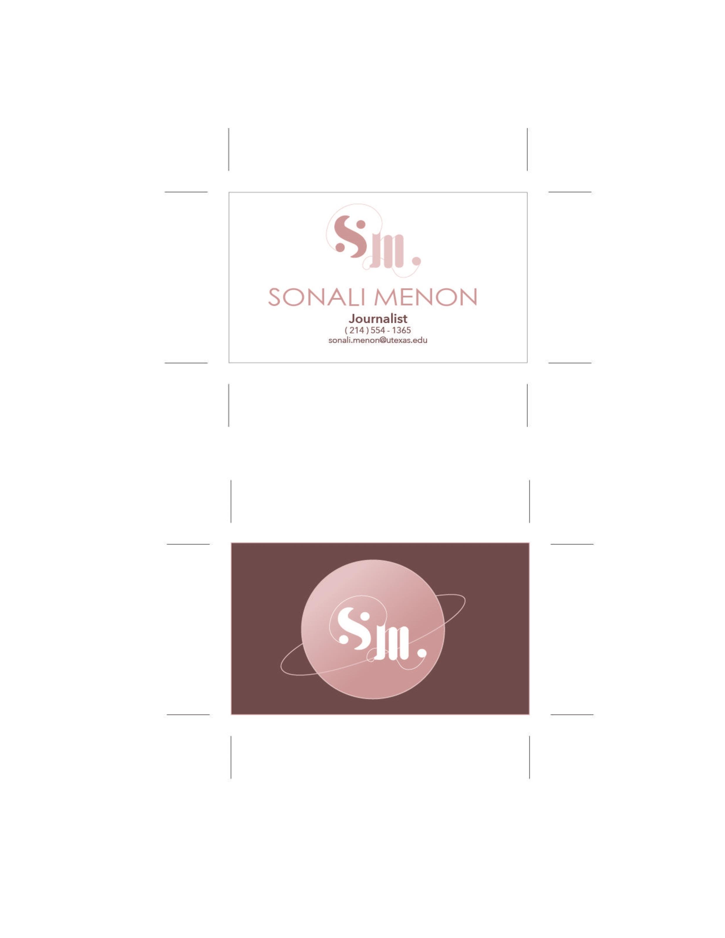
When developing a vision for my personal brand, I knew I wanted it to have a celestial, elegant, and futuristic aura. I chose to incorporate circular, orbital, and planetary imagery in my design because I currently focus on scientific research reporting. To convey this elegantly celestial theme, I wanted to contrast simple sans serif fonts with cursive-adjacent sans serif fonts. I also decided to use a blush-toned color palette because it is very soft and has a fresh connotation. However, since they are muted tones, they still appear professional, unlike if I had used more vibrant pinks. I mainly focused on a medium blush tone, which I incorporated into my text’s logo and headers. I contrasted this color with a dark, brown-toned blush shade, which I used for the body text in my resume and cover letter. For information I deemed less critical in my documents, I used a light blush tone color font and this shade in my logo to add contrast to the design.
For my logo, I wanted to set it apart from the other elements of my identification system by making it curvier and incorporating a more celestial theme. I used the medium blush shade for the “S” in the logo since it stands for my first name, so I wanted it to be the most distinct element on the page. I used the light blush tone for the “M” to create a stark contrast between my initials and make it more readable. The “M” and “S” are connected at the terminal of the “S,” where they join in a closed circle. The reasoning for this was to incorporate subtle imagery resembling the orbital pathways of planets. The curvy line connecting the two letters is ovular in shape, and the circle is meant to be emblematic of a planet. Similarly, the “M” has a serif on the bottom left-hand side of the first stem, which flourishes into a loop and ends with a circle. This flourish was made similarly to the previously mentioned connecting line, as it was meant to be a loose representation of planetary orbital paths. I wanted the apexes of each letter in the logo to be at different heights to show a hierarchy of importance. Therefore, the “S” has a higher apex than the “M.” To maintain uniformity with the two letters, I tried to keep the cap height of each the same. To create a more elegant and curvy logo, I wanted to make the “S” have apparent stress on the spine leading up to each circular terminal. I separated the “S’s” terminals from the spine to create visual interest and add to the planetary theme. I chose to portray the logo’s “m” in lower case to emphasize its capital “S.” I also added two hairline strokes to the shoulders of the “M.” Including this adds a more elegant effect to the overall look of the logo and creates more visual interest and uniformity to the design by mirroring the flourishing lines.
I used three similar fonts to create the hierarchy in my resume and cover letter. First, I used the font Hei Light for my title name on the resume because it is clean, and the cap height of the letters is tall and uniform. I also used this font for my name on the business cards and the letterhead. I also used Hei Light for my info line on all the components of my identity system. I did this because the info line always follows the title name, so I wanted them to look uniform and as if they came together in pairs. Then, I used fonts from the Avenir type family for the hierarchy on my resume. I chose to use the fonts from the Avenir family because they are sleek, modern, and sans serif, which fits the sophisticated and astral aesthetic of my identity system. For the headers of each section, I used Avenir Next Condensed in medium and all caps to make it stand out, as well as to conserve space to create room to list all my credentials. Next, I used Avenir Next in medium for the dates to match the header but in a less bold way. Then, I used Avenir Next in medium for the bullet points listing my responsibilities in each position and my skills list because it is the most readable font as the kerning was far enough to where the letters are easily distinguishable. I also used Avenir Next in regular for my cover letter. I used a 12-14 point type size for the resume’s body and made the leading 2-3 points greater than the type size to ensure that the document would have loose kerning.